Opinion - Dashboard or Wallpaper ?


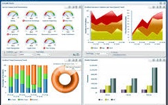
Dashboard or Wallpaper, what's the difference?  The easiest way to describe it is that a Dashboard is exactly that, a clear and concise representation of actual Business Performance compared to specified Targets and Ranges, much in the way a Car's Dashboard shows you the key operational functions in a single glance. As with the Car's Dashboard, you don't want to be distracted by functions that are operating in the accepted ranges, but have brought to your attention those that are reaching critical Levels.

In comparison a Wallpaper, also referred to in many cases as a Dashboard,  is a collection of Graphs, Charts and Summary Reports arranged in a single view. Whilst the purpose of a Wallpaper is to provide a single view that represents all major Business Performance measures, it will invariably take longer to interpret and may not provide any reference to desired performance. As stated, Wallpapers are more a collection of Graph, Charts, Reports arranged together for the purpose of enabling business analysis from a single page rather than viewing each Chart or Report individually.  The value of have a collection of Graphs is that it can help in the identification of linked results and trends.  A Wallpaper may include two Trend Lines, Year to Date Overtime and Year to Date Sick Leave and it may be that the two Trend Lines follow the same pattern that when Sick Leave increases so does Overtime.

So why would you use a Dashboard over a Wallpaper?  It comes down to the audience and purpose.  Again using the Car analogy, think of you Senior Management Team as the drivers, do they care what the average fuel consumption is, number of gear changes per lap, amount of time spent in the upper power band?  No, they are busy running the company and want a simple readout that will tell them that all is as it should be with all gauges in the correct ranges and no flashing red lights alerting them to the fact that something is seriously wrong.  Next think of your HR Analysts as the mechanics, they do want to know the average fuel consumption, tyre wear, optimal power bands, and so on, as it is their job to work out how to get the best out of the Company and provide advise on what the optimal target values and ranges are.

What would a Dashboard look like?

With this example the Dashboard has 4 key elements for each result :-
  • A Gauge to show the Result in reference to the accepted Range
  • The Target Value
  • The Actual Result
  • A simple 'Traffic Light' as a secondary gauge of performance
Here two graphical representations of the result are used, a simple Traffic light indicator to provide an immediate interpretation of the results and then a dial style gauge to represent the results with reference to their respective ranges.  Here we can see instantly from the red traffic light that the Overtime Hours Ratio is unacceptable and also that it is an extremely poor result with the gauge at the extremity of the range.
What would a Wallpaper look like?

This example looks to provide similar information to that displayed in the Dashboard, focusing on Overtime, Attrition and Annual Leave.

In this Wallpaper only a couple of Chart Types and Reports are used. This method of summary display shows more information regarding the result and the information contributing to the result.

Looking at the sample Dashboard and Wallpaper, it becomes quite apparent that more interpretation of the Wallpaper is required with no immediate designation of a good or bad result.

So which is best?  As stated before, it comes down the the intent and the audience. Personally, I prefer a Dashboard as the means of viewing overall performance results and to use independent Charts and Reports for the further interrogation of Results.  I like the concept of a Dashboard instantly highlighting areas of concern and pointing me in the direction of where I need to investigate further.